Blending E-commerce and Editorial Photography: Tips for Stunning Product Shots
Tabio Socks: A case study in making e-commerce imagery ….well, cooler.
In my last blog post, I explained the difference between editorial and e-commerce photography. And in this one, I’m going to explain how we might blend the two. (Getting advanced over here.) When we think of typical e-commerce photos, they are often shot or photoshopped onto a pure white backdrop to make the product really pop without distraction. But do they always have to be?
When I got the email about shooting for the latest Tabio sock launch for 2023 AW, I was thrilled to say yes for a few reasons. Tabio is passionate about quality and craftsmanship. A family company with over six decades of experience creating socks, it was a privilege to work alongside people so passionate about what they are creating. Our talented international team also included styling expertise by Iryna Li and the creative touch of set designer Colin Lytton (highly recommend them both).
E-commerce and Editorial Blended: A Perfect Match
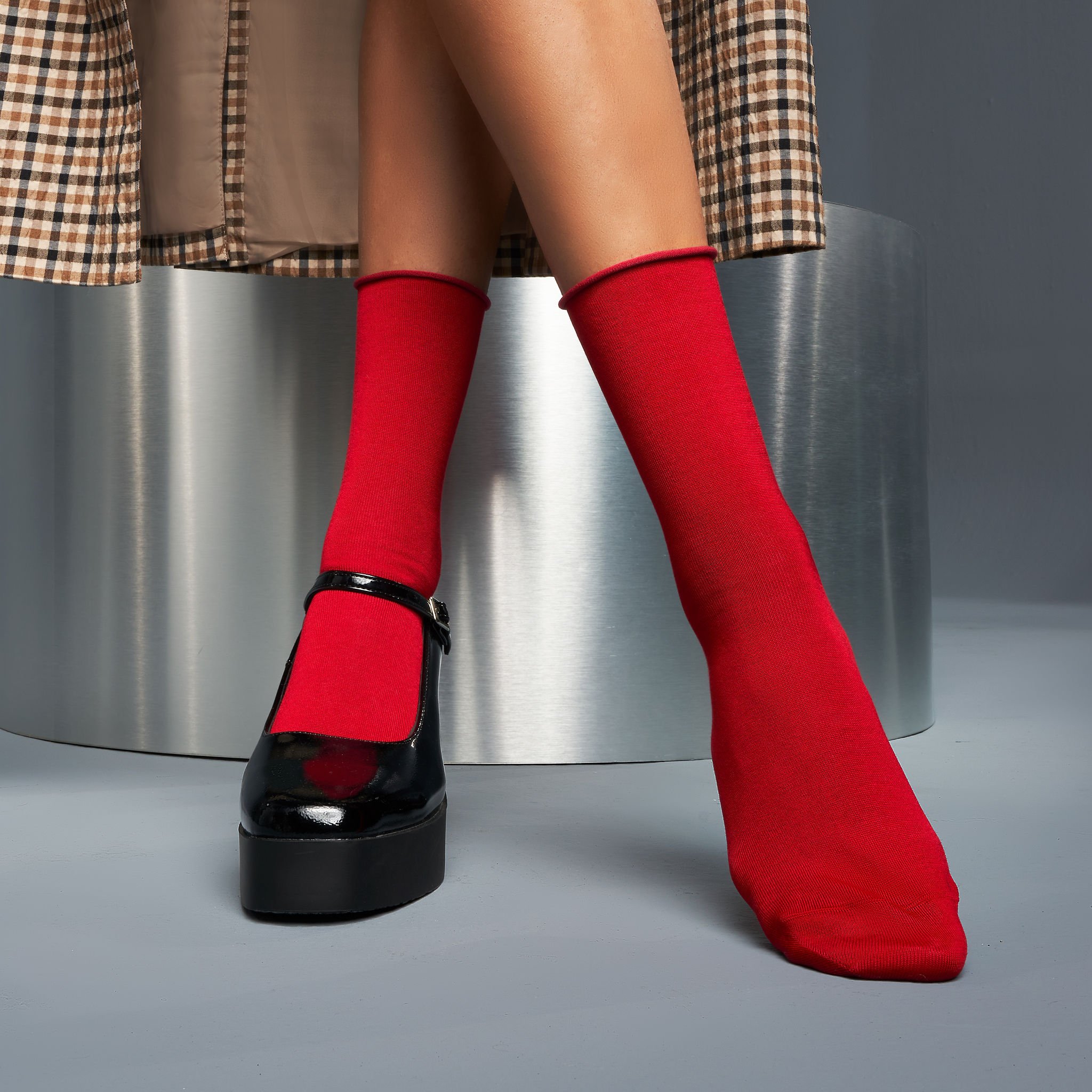
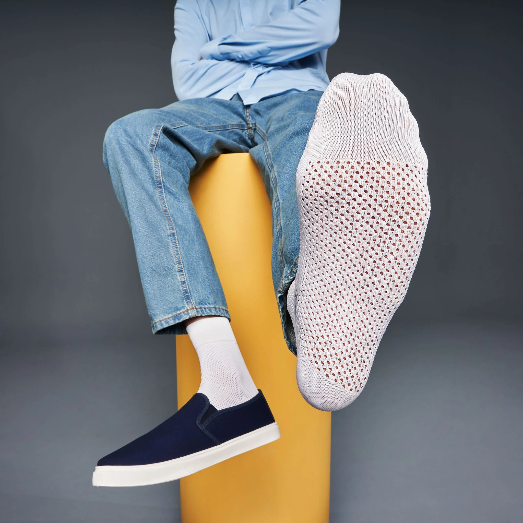
Because the shoot was for e-commerce, our highest priority was making sure a viewing customer could understand exactly what the sock looked like. But we also wanted to tell Tabio’s authentic story of being an exceptionally high-quality sock for fashion-conscious consumers. The images needed some of the edge typically seen in fashion editorial imagery. We accomplished this through a few important factors: lighting, posing, lens choice, and styling. On my end, I planned to use hard light and wide angles. The professional models and stylists played a huge part in keeping the outfits and the posing in the world of fashion as opposed to a more commercial look. (Think Prada versus Old Navy.) I think this combination was really successful and it is my favorite e-commerce shoot to date.
Tips for new photographers and clients:
The Tabio shoot is a great example of shooting e-commerce photography with a slight editorial edge. Walking the line between those can make for some dynamic and interesting product shots that still show the product while also telling the brand’s story. No two clients are the same, so the techniques I used here won’t necessarily translate to my next client.
Don’t let the fact that the shoot is for e-commerce completely limit the shoot to a pure white void. As you can see here there are always options!
In the pre-production process, ask your client to describe their brand and how they’d like their images to look. For example, “cool”, “edgy”, and “fashion forward” versus “soft”, “approachable”, and “natural”. These will all help you choose your lenses and lighting setup.
Because this is e-commerce, color correction, texture, and consistency are - and I cannot stress this enough - vital to the shoot.
Lighting and color temperature must remain consistent. Adjust as needed for dark darks and light lights.
Avoid using any bright-colored lights that might spill onto the product.
Avoid distractions: the props in this shoot were successful because they added interest without taking away focus from the product.
If you have questions about ways we can work together or if I can answer any questions, please feel free to reach out!


